QuiltCon: Menswear, muted exurberance
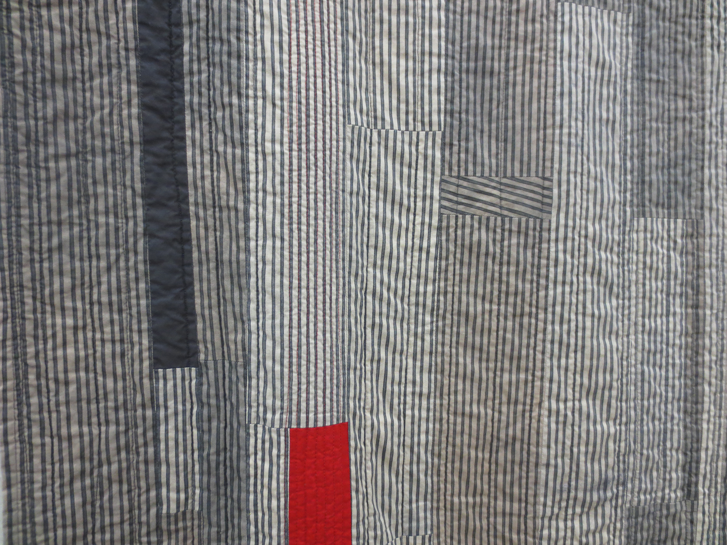
It's been almost six months since QuiltCon. Reflecting back on some images and inspiration I found there, the same old familiar things are popping up: I am now and always have been drawn to menswear prints and patterns. The muddy browns and suit-wear greys and hunter, army, grassy greens. Plaid, stripes, and checks. Browns on top of blacks. Speckles of cream. The color inspiration is endless -- it's a challenge in finding the perfect combination between drab and daring. It's about making the seemingly boring man's color palette fresh and evocative. What I love most about menswear-inspired quilts is that we are drawing so much direction from these "boring," everyday elements of life and style. But we can use them to say so much. To make this quilt, the artist hand-dyed strips of this striped fabric, so that it took on additional shading and depth, and then put all the strips together to create the larger movement. The red is exactly the protest we need to break up the stripes.
Do you see that tiny patch in the upper-middle where the stripes run diagonally? Utter brilliance.
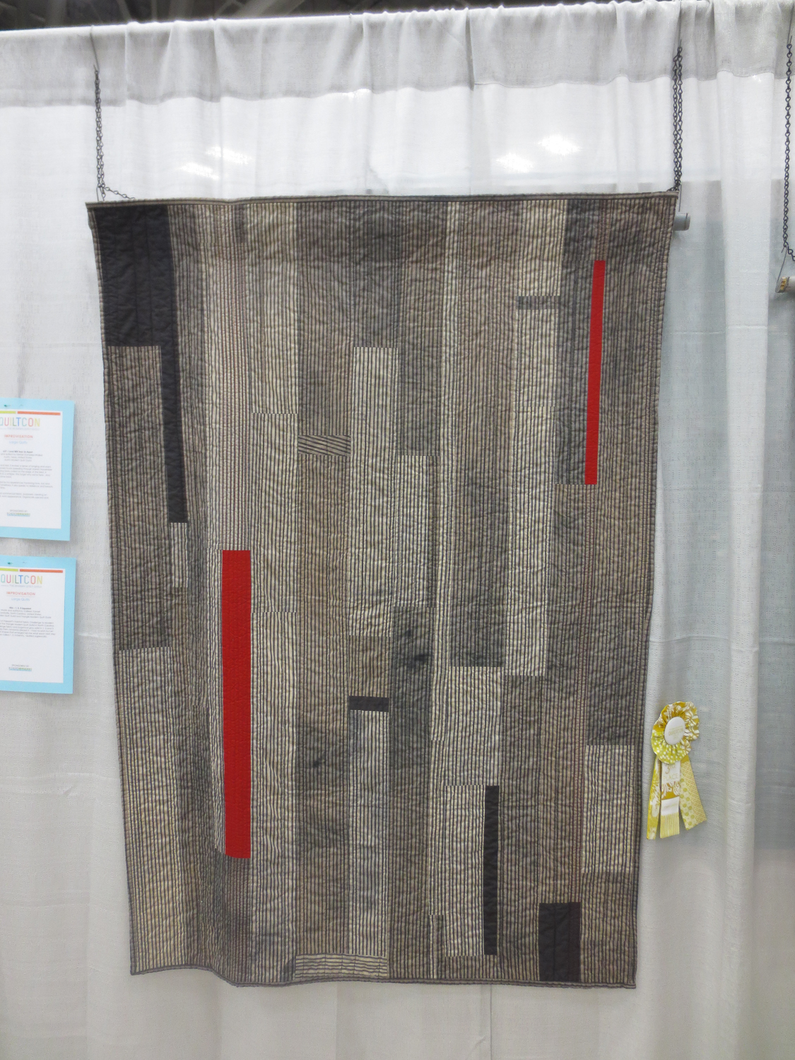
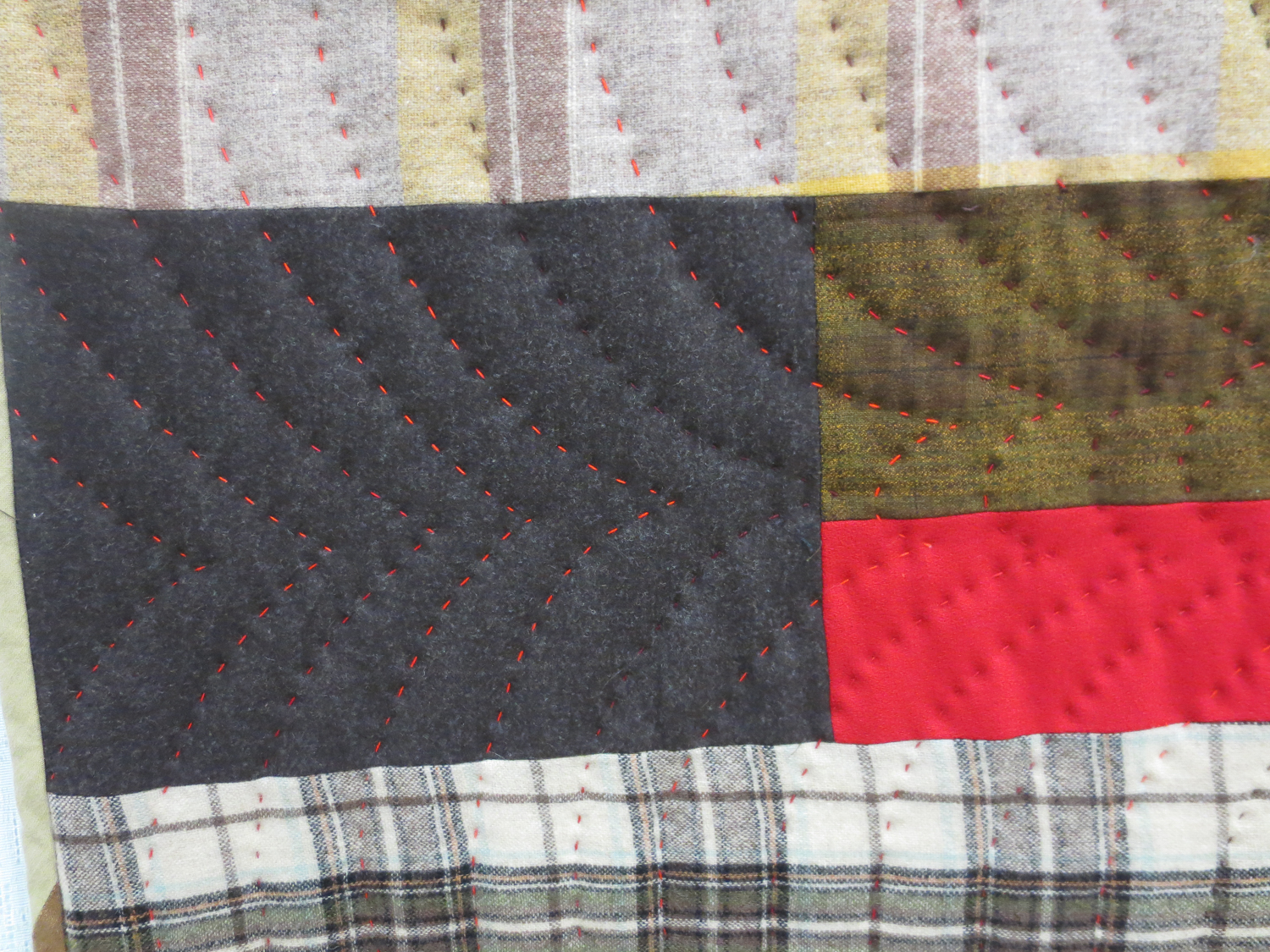
Not to mention some shots of red stitching every so often. I was obsessed with the coloration and distress of that striped fabric. I kept coming back to this quilt.
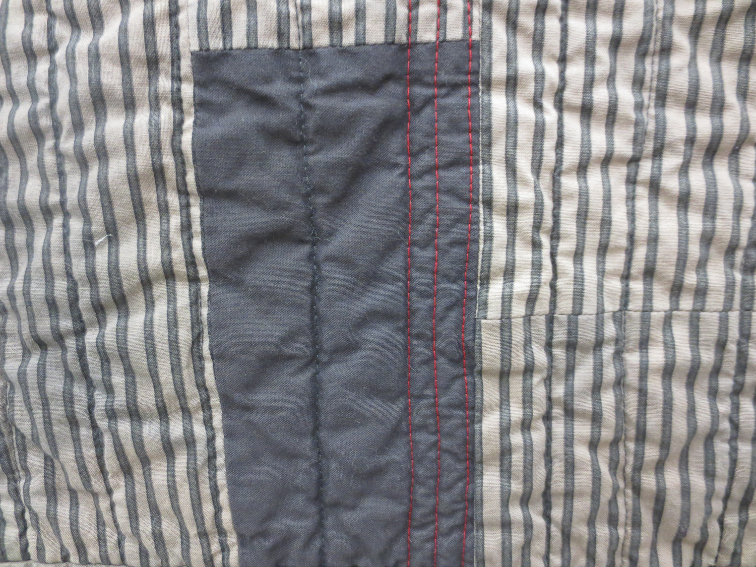
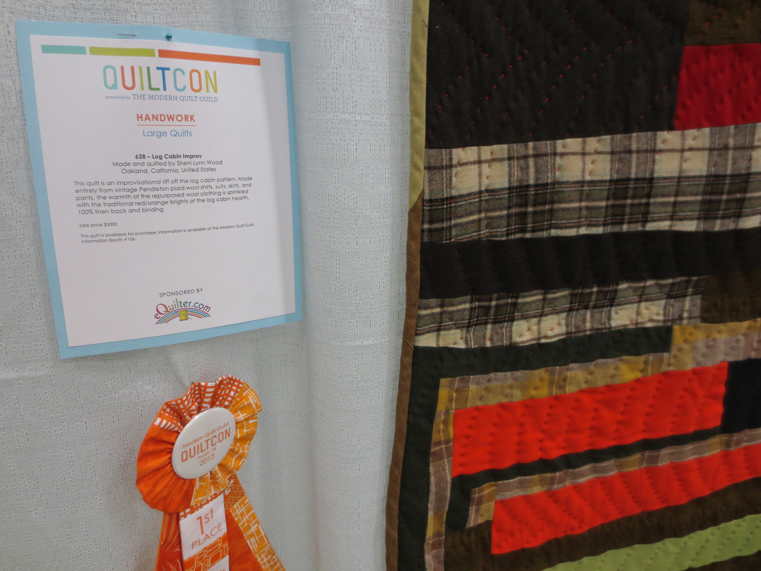
This quilt, "Log Cabin Improv" (below) goes brilliantly beyond my comfort zone. I have been working on my own menswear-inspired quilt, it's been on the back-burner for years now, and I always end up hating it. Honestly, if I was making this quilt, with its garish orange and hot pink, I would probably have hated it. It would feel uncomfortable, and I would work knowing the risk, knowing it might come out looking absolutely putrid. Or ridiculously BOLD. This quilter has blown right past comfortable, and miles past "safe" with her wonky squares and unnatural color combinations. Plus, that plaid. This quilt reminds me that it's okay to test the boundaries of color and line.
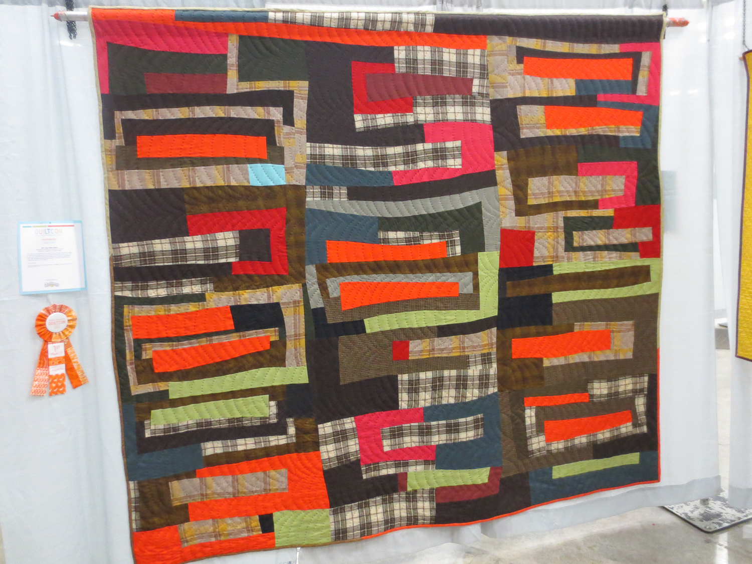
When you're up close you can see the lines and lines of red hand-quilting.
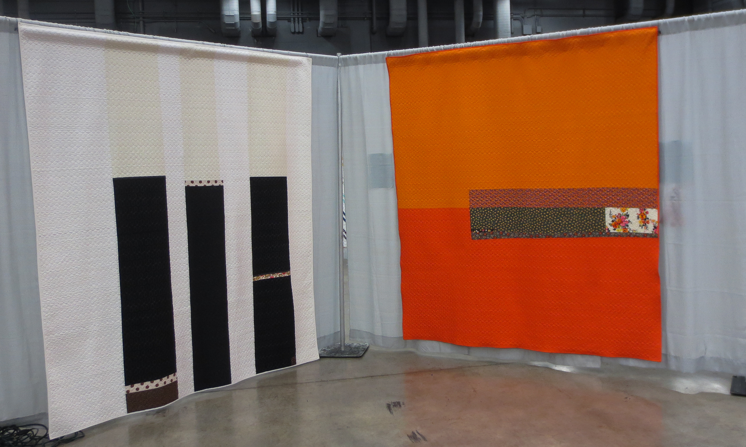
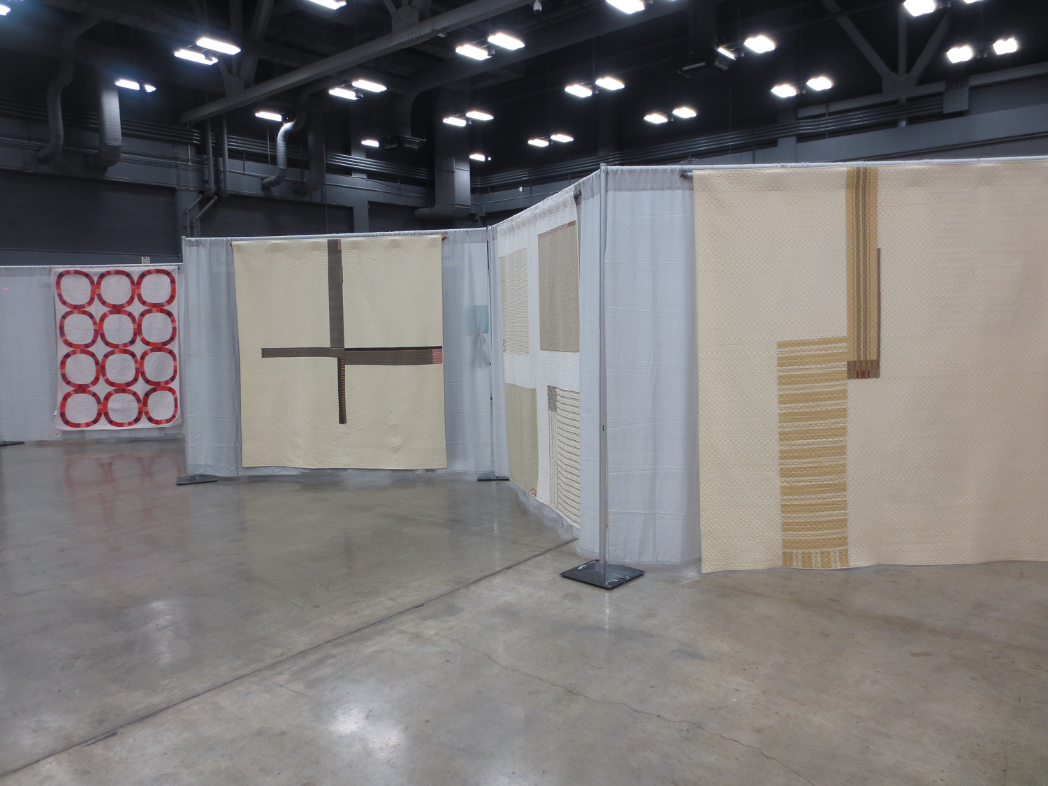
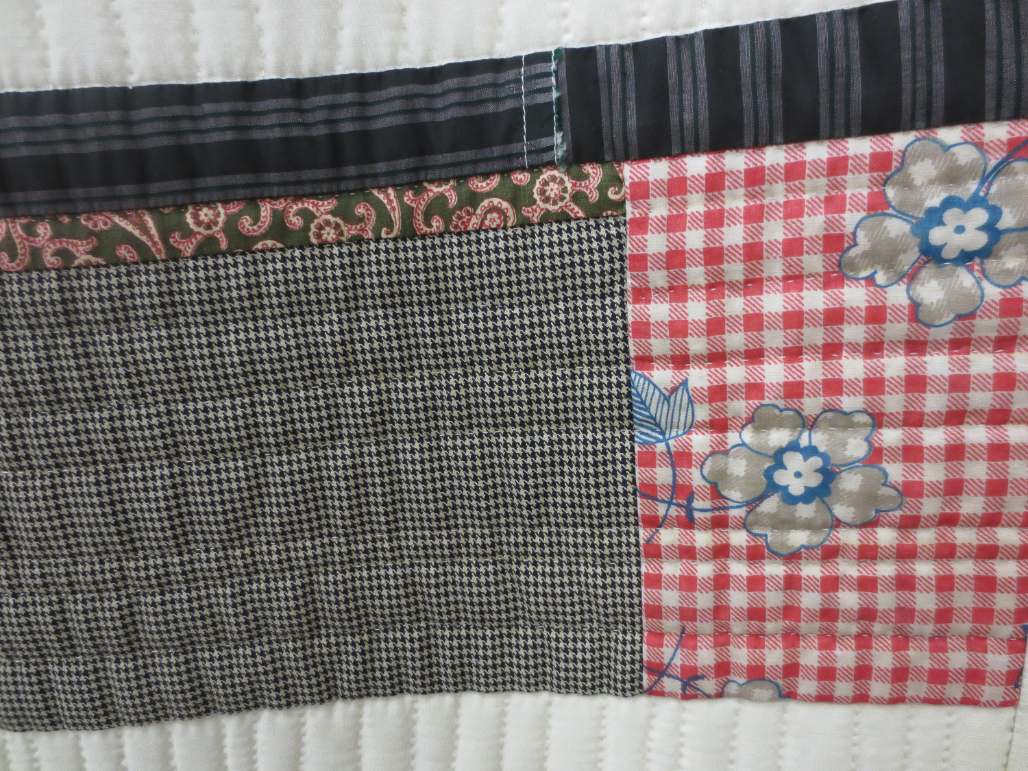
And then, of course, you have the modern master of austere quilt design: Denyse Schmidt. Many of my favorite quilts of hers scream "menswear." They are simple, bold, and maintain drab color schemes, but with token quirks, little pieces of frivolity if you take the time to find them. One of the best things about seeing a whole bunch of her quilts in person was seeing the non-traditional fabrics she used, bits of mismatched motif here and there, hard canvas mixed with an actual polyester dress shirt scrap.

She does it so well, it's become cliché. It's been copied, it's inspired a whole movement. It's nothing new. But experiencing these austere quilts in person felt entirely different from seeing them on Denyse's website, or in books, or on Pinterest. It was experiencing another dimension of their beauty, which is, in fact, literally what was going on. The colors look different, so that even my own photos here do none of it justice. The textures of the fabrics play off each other in unexpected ways.
These quilts in real life are far more worn, faded, rustic, used than they are in professional photos. Much of that is because the quilts featured in the exhibits either came from her own personal collection or the private collections of other people, out on loan for QuiltCon. And this gets to the heart Denyse Schmidt's original inspiration, that quilts are art that is used, that serves a very utilitarian purpose. It is the opposite of a potted plant or a piece of art done in oil paint, though those things also provide aesthetic pleasure. The quilts in real life had that roughness, that worn quality, and it made them even more stunning. They are not precious exhibit quilts that live inside museum walls.
And that takes me back again to the whole philosophy behind modern quilting that I find so appealing: it should not be too precious. It is not about crafting a perfect object, every triangle with its tip perfect, to hang on a wall or even in a quilt show. It's about making something that is at once pleasing, lovely, artistic, and useful. It is about using elements of everyday motif, pieces of cloth we already have and love, and putting them together to form an entirely new bit of commentary on Life and Art and Comfort, and the combination of these three things.
And with menswear thrown in, I would even go so far as to say we are adding to the conversation about Work, and its place in our lives. Work is there in the patterns and fabric textures. Work is there in the labor we invested in selecting, placing, cutting, stitching, basting, quilting the layers together, to make the final thing. Work is there in the memories of former workplaces, good and bad, and the dreams or dreads of new ones. It's the warehouse floor, a dull concrete. It's my grandfather's buffalo plaid and baseball cap. It is the pot of coffee in the break room and the wooden table in the conference room. It's your parents' workplace, it's your daughter's workplace.
Work, which is every bit as crucial a part of the conversation of art in our lives. All that lives inside a menswear quilt, when I see it.
Menswear prints were used and interpreted in many ways at QuiltCon. Each one added to this commentary, and to the breadth and meaning of the modern quilting movement.
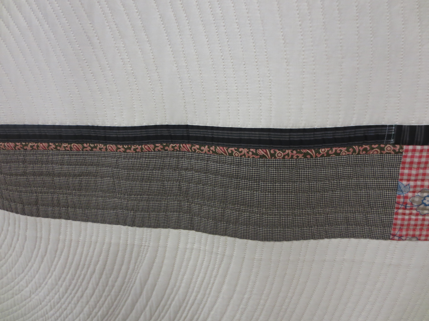
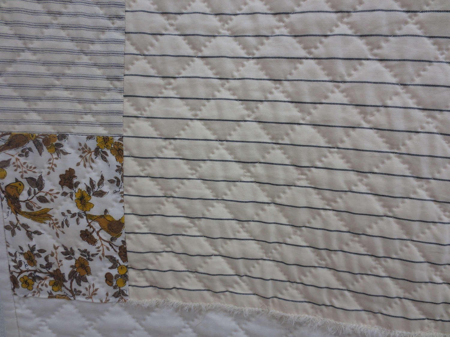
In this one, the cream-and-grey striped piece is sewn right on, frayed edge kept entirely intact. Those are the kinds of things you never see in a lifetime of online browsing.
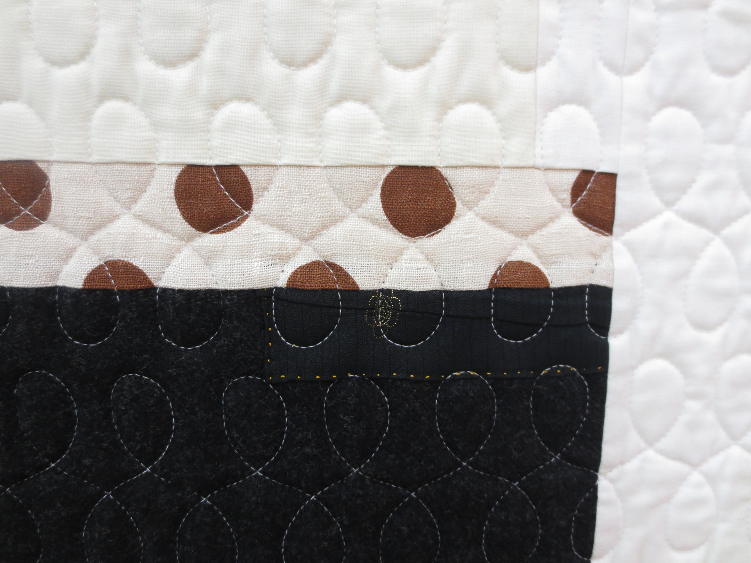
Just looking at these few images again makes me want to run home and spend the rest of the night (and tomorrow) with my fabrics, cutting, sewing, putting them together in unexpected ways, drawing from everyday sources like The Office for inspiration.
Sparse stripes. Various textures. Tiny sparkles (like that little hint of a golden flower in the solid black piece in the quilt pictured just above). Retro flowers. Stripes on stripes. Herringbone. Buffalo plaid. Paisley. Houndstooth. Heaven is a menswear motif.

