Lauren & Dave's Michigan Pixel Quilt
This quilt was the confluence of several ambitions. The first was to make a Michigan quilt. I was born there, in Southfield, a suburb of Detroit, and lived in a couple sleepy towns in the Upper Peninsula until I was almost eleven. This corner of the country holds a special place in my life and memories, and I continue to explore its influence in my life as I plug away on a novel set in the U.P. and northern Wisconsin. (The culture of the Upper Peninsula is arguably more closely related to Wisconsin than it is to the Lower Peninsula.)
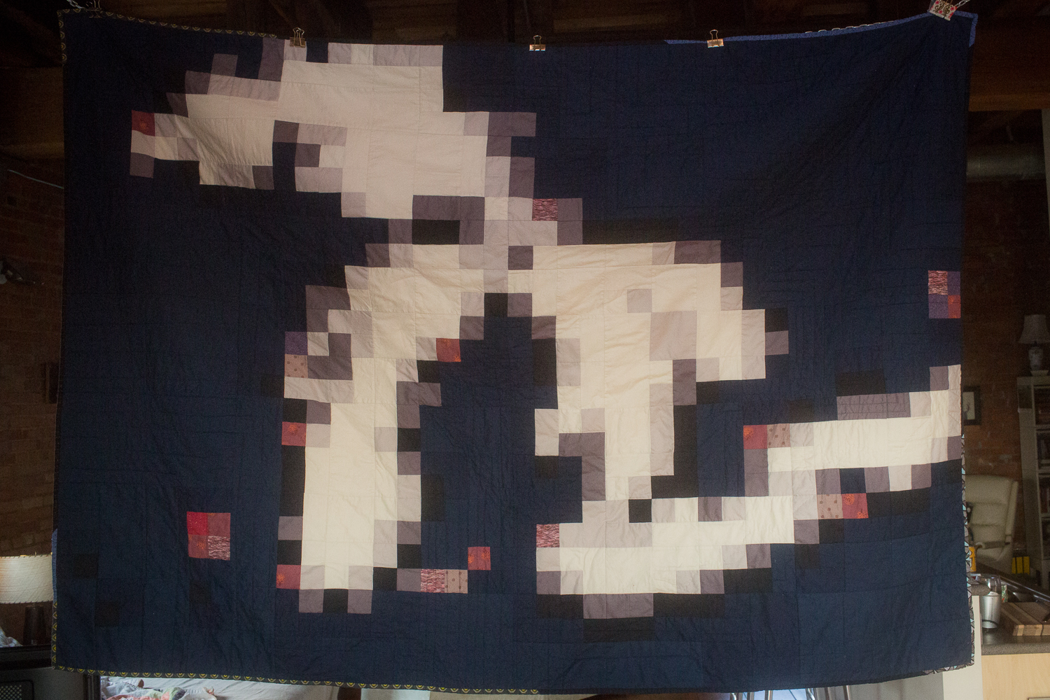
Anyone who's lived in this region recognizes the shape of the state, it's unmistakable, one of those distinctive combinations of land and water you can always identify. It's the kind of iconic geographic image you'd surely know from space. So I wanted to put this image on fabric, make it from fabric. But my only ideas involved variations of appliqué, since the outline is fairly intricate. I didn't really know how I was going to effectively portray the map in fabric.
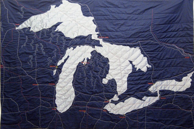
The second thing was the impending marriage of my childhood friend Lauren and her now-husband Dave. Both were raised in Michigan and their families still live there. She and I went to Young Fives (kindergarten) and Kindergarten together in Negaunee, and Dave is from Lower Michigan. They now live in Athens, Georgia, funnily enough, just an hour and a half away from me, where they're in a nueroscience PhD program.
I knew that this was my opportunity to make a Michigan quilt that I could actually share. I have far too many around my house already, so I always look for the kind of home that can benefit from a cozy quilt. Being far away now from their homeland, I knew if there was anyone who would appreciate the outline of my native state, it would be these two. I didn't get it to them before the wedding, but sent it so that it was there right when they returned from their honeymoon.
![]()
So this pixelated image is what I used to convert the geography of the state and its Great Lakes outline into a patchwork of gradient fabrics swatches. I happened to mention that I wanted to make a Michigan quilt to one of my friends at the West Atlanta Modern Quilt Guild, and she mentioned pixel quilts. Had I ever thought of doing it that way?
I hadn't. But there's an online tutorial, she said, for turning a picture into a pixel quilt. It's Caro Sheridan's From Picture To Pixel Quilt, and it's free on Craftsy. I highly recommend it. This concept seemed entirely intimidating to me until I walked through the steps and videos she's laid out.
Creating the image above is the first step. The next one is below. It involves a lot of formulas in a Google Docs spreadsheet, and then breaking it down more and more. It helped seeing her go through it step by step to understand how few colors I really needed, and to perfect just how pixels I could include to maintain the shape without going insane. There are some really crazy quilts on the internet (just Google image search "pixel quilts") that must have taken thousands of hours, portraits and very intricate renditions of photographs. The point was not to want to commit suicide, but to make a modern quilt that interpreted Michigan in a fresh way. So I kept that as my goal.
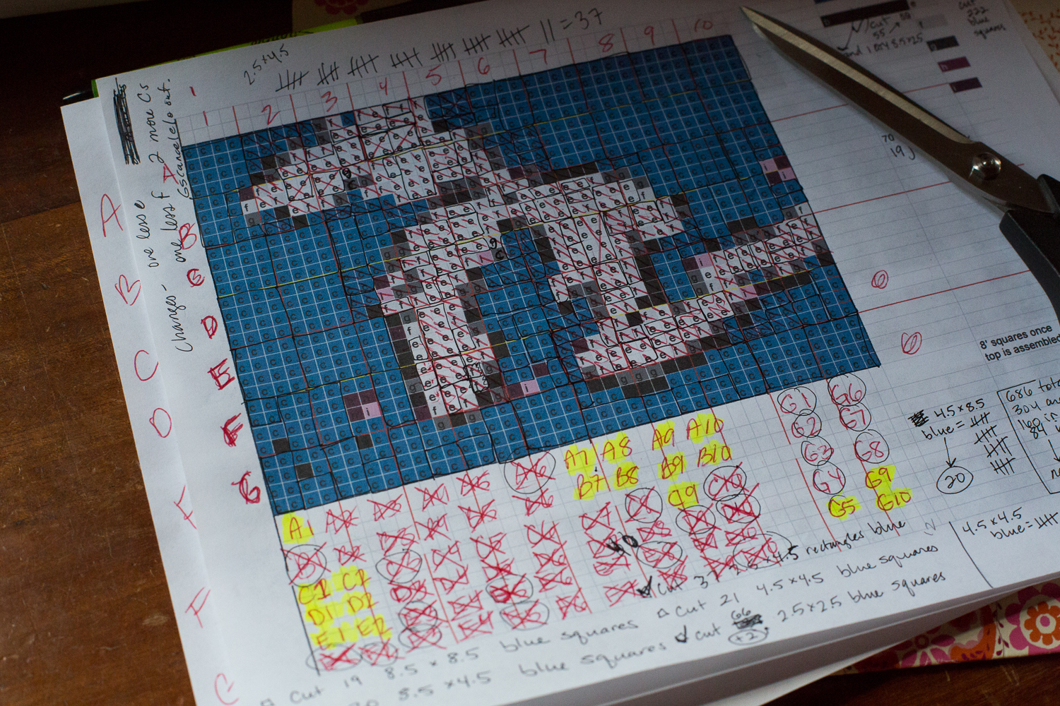
Section by section, I put it together. It came down to one shade of blue, two shades of grey, a dark almost-black (Kona Pepper), and a beautiful, rich cream for the lakes. I know technically the blue would be water and the white doesn't make sense, but I just loved the blue-and-white image more than traditional maps that I tried out in pixelation.
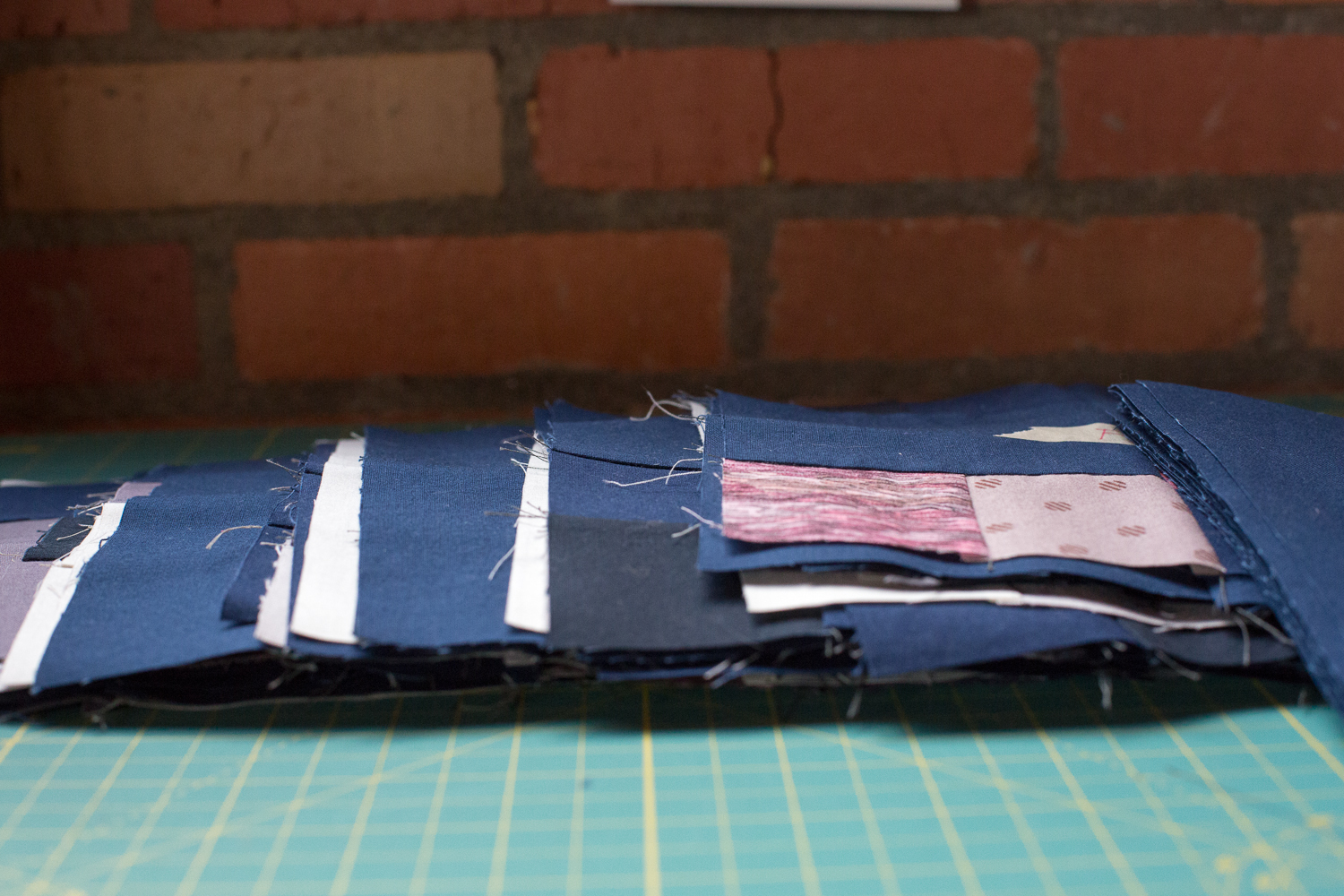
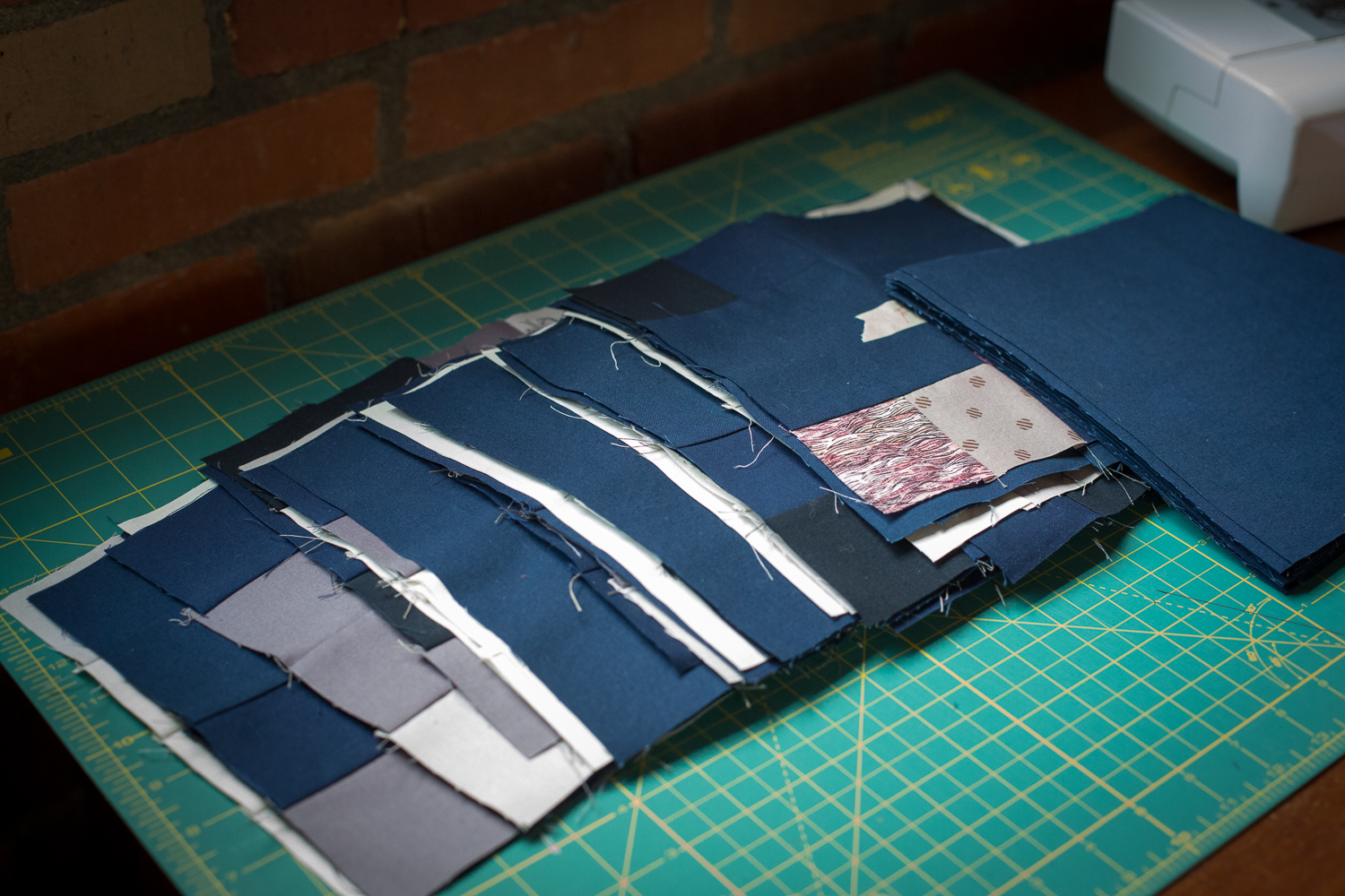
Stacks on stacks on stacks of squares and rectangles.
Before long, actually, they were all there, methodically pieced and labeled each time I finished one. They're really just 8 Patch squares, sometimes 16 Patches. Masking tape was crucial in ensuring I had them oriented correctly and in the right order left-to-right and top-to-bottom.
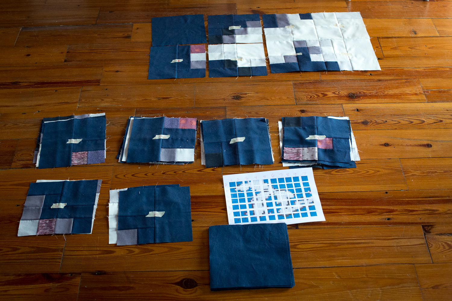
I threw in the mauve shades when I noticed the bits of purple and pink that popped out of the original pixelated image. I want to encourage you, if this seems overwhelming, to go through Caro's tutorial. And don't let the math intimidate you. I took this as a chance to learn some new skills, design my own quilt pattern, and work through all the cutting and planning and required fabric on my own. I've done this before for improvisational quilts, but by the very nature of an improv quilt, that rules don't matter all that much, and measurements are only guidelines. This was a wholly rewarding process and learning experience.
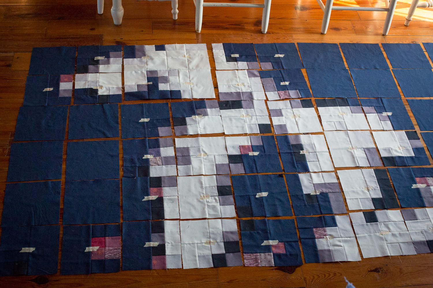
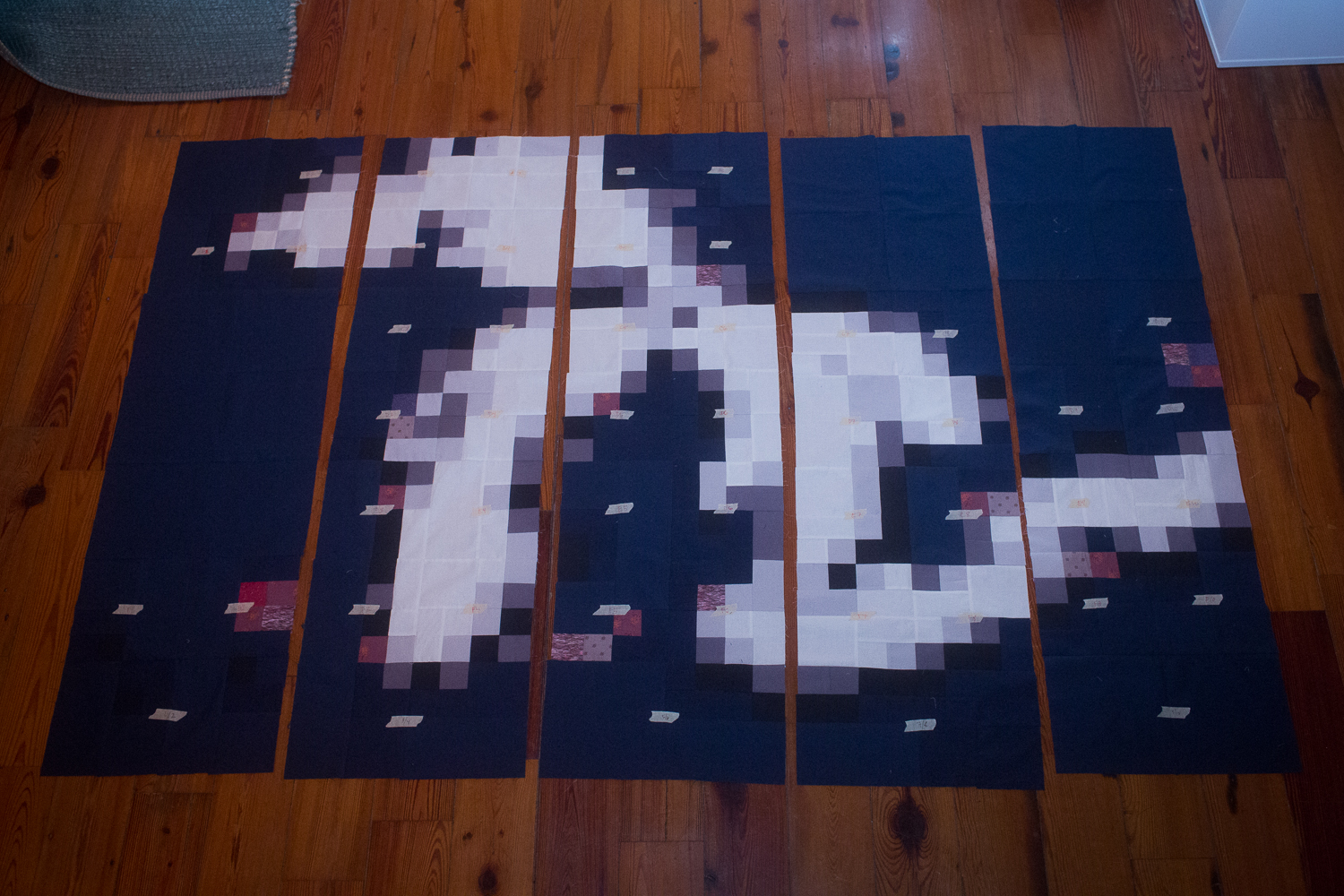
This was when it all started coming together. Below, I was playing around with the order of the strips, once they were coming together, to see if I could make it incomprehensible. I'm pretty sure this looks like a whole bunch of pixeled nothing.
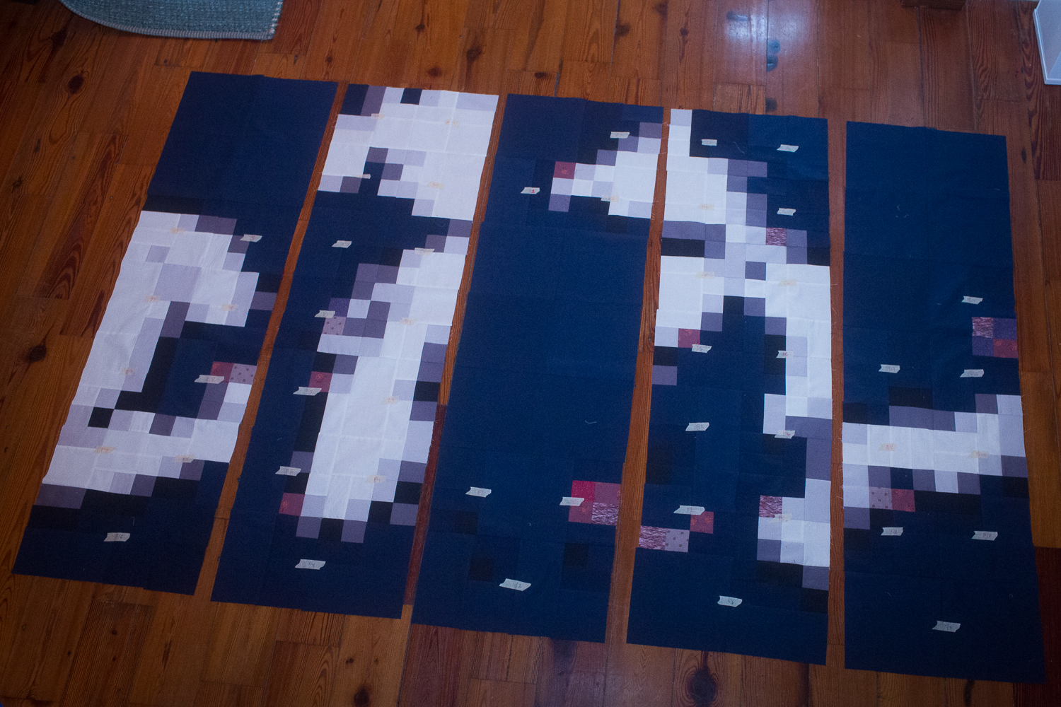
And there it is almost ready to be a whole quilt top, in correct order. Lakes Superior, Michigan, Huron, Erie, and Ontario, all present.
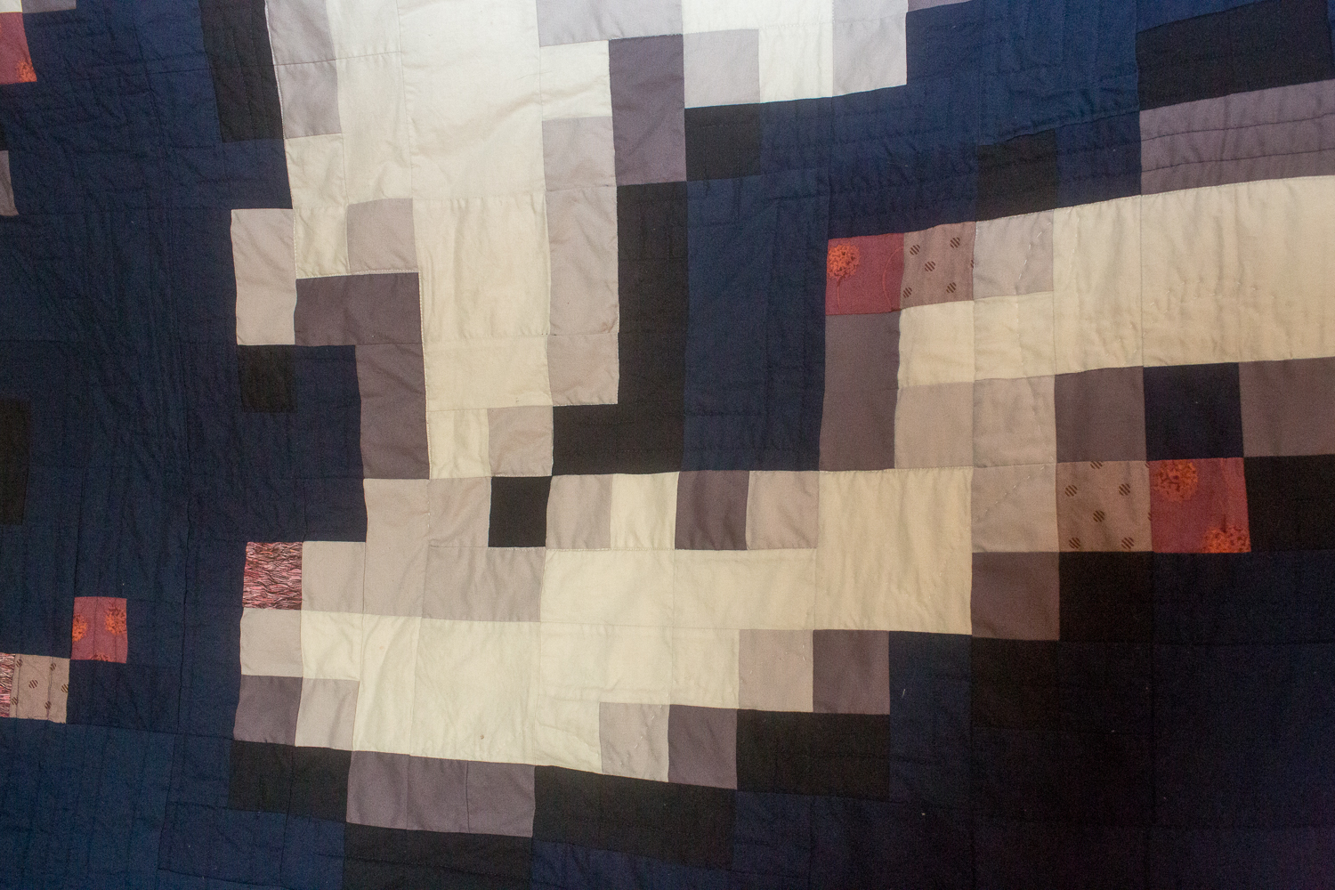
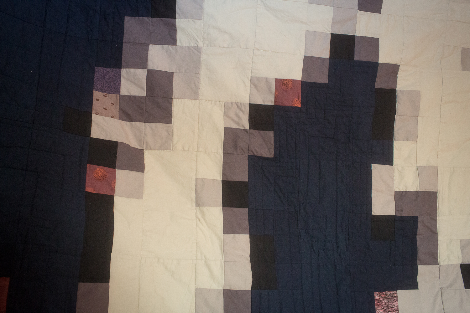
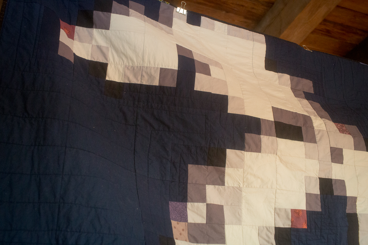
For the quilting lines, I decided to do straight line quilting, which I always gravitate to, but in a kind of echo pattern around the lakes, within just the blue. In the creamy lakes, I did a stitch-in-the-ditch outline all the way around, almost clockwise, if that makes sense. They're all connected, so I didn't have to stop the stitch lines anywhere, I just powered through, top-right corner of Ontario back around to the bottom-right corner. Eastern-most to eastern-most, technically.
The backing actually took a lot long to decide than any of the front fabrics. I don't like to do very much piecing for the backs, and by this point, I was all out of patchwork energy anyway. But it's always a struggle to find the right scale of a print. I did want a print, something reminiscent of a forest, the woods, trees, rustic nature, a lakeside vista, a cold winter morning.
My mom, living over in Italy, got about a dozen emails from me with links to certain fabrics on Fabric.com, none of which had quit the right aesthetic to match the front of this quilt. Too cutesy, too small a scale, too bright, too blue, too green, to traditional. I was getting pretty concerned.
And then, through some magic of clicking and searching across the site, my favorite online fabric shop delivered exactly the right thing. Nature's Etching Birch Bark in Rust/Bark tone. Exactly. Dead-on. I am reminded of snowy mornings, and rusty cars that've driven thousands of miles on salty roads, and the blue-greens of an evergreen forest. It is exactly the fabric to represent the elements of a tough, beautiful landscape in a remote region of the country.
Once I found the right thing, it was a no-brainer. I was reminded how obvious and easy a choice it is once you've found just the right thing. All those other options I felt lukewarm about were clear warnings of the wrong thing. I was on the fence because it turned out I was in the wrong neighborhood anyway.
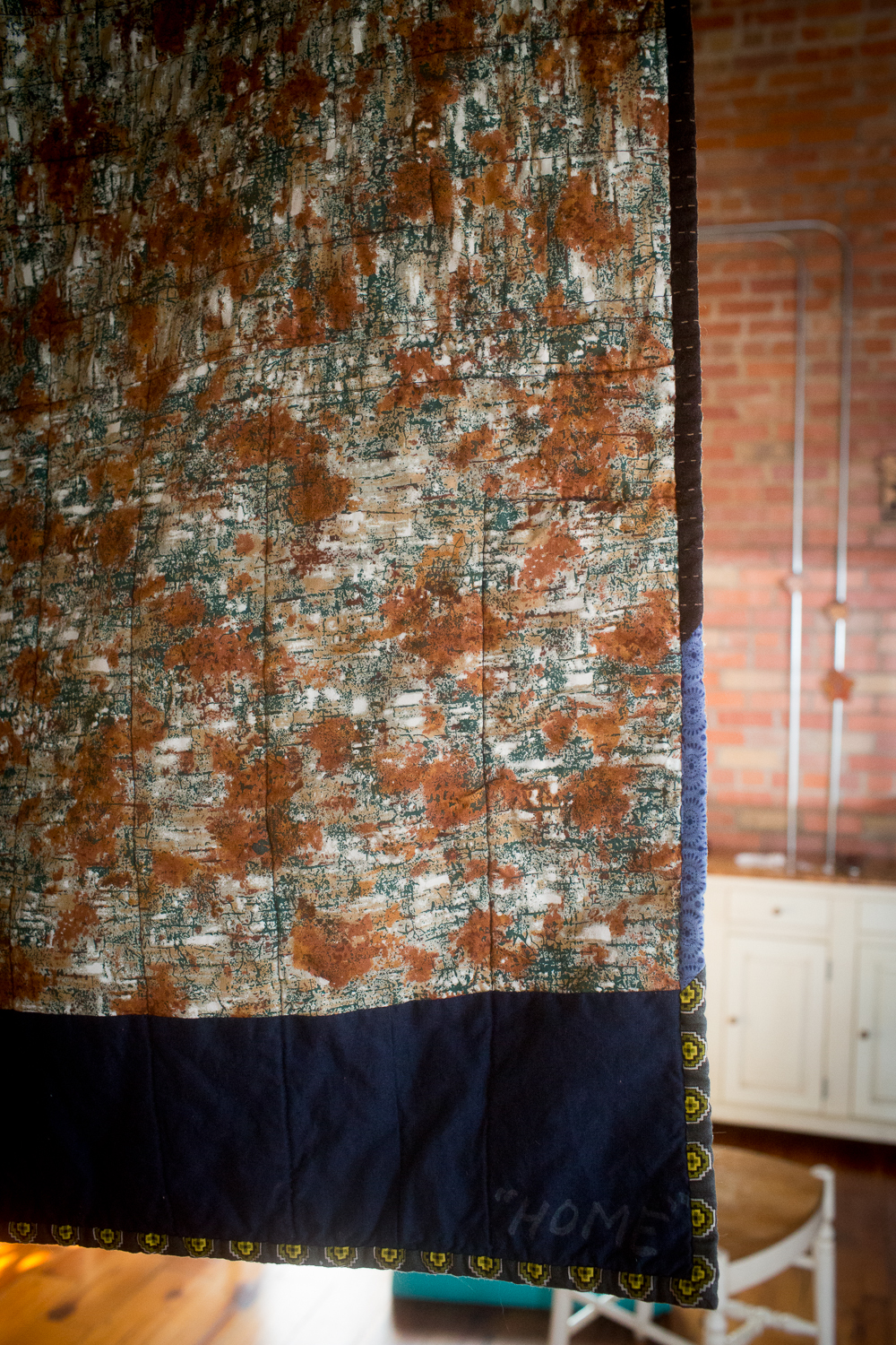
Appropriately, I named it HOME. Home for all three of us, in one or another or a hundred ways. I ran a stripe of blue along the back edge because, of course, I underestimated the square inches I would need for the back, as I often do. Imperfections give quilts their handmade character. I'm OK with it.
For binding, I did something I've never done before: I used a variety of prints in my long strip of straight-grain binding tape. This was my chance to use a few fabrics that went with the motif, but would not have worked in the quilt top. It was risky after all this to put patterns on the edge, but I always love when other quilters do bold things with their binding, and so I pushed my own boundaries. I'd already done this insane self-invented pattern, worked out all the fabric cuts and arrangement and gradation, and expanded my skills with all that. I might as well also make myself uncomfortable with a bright binding. I love how it turned out.
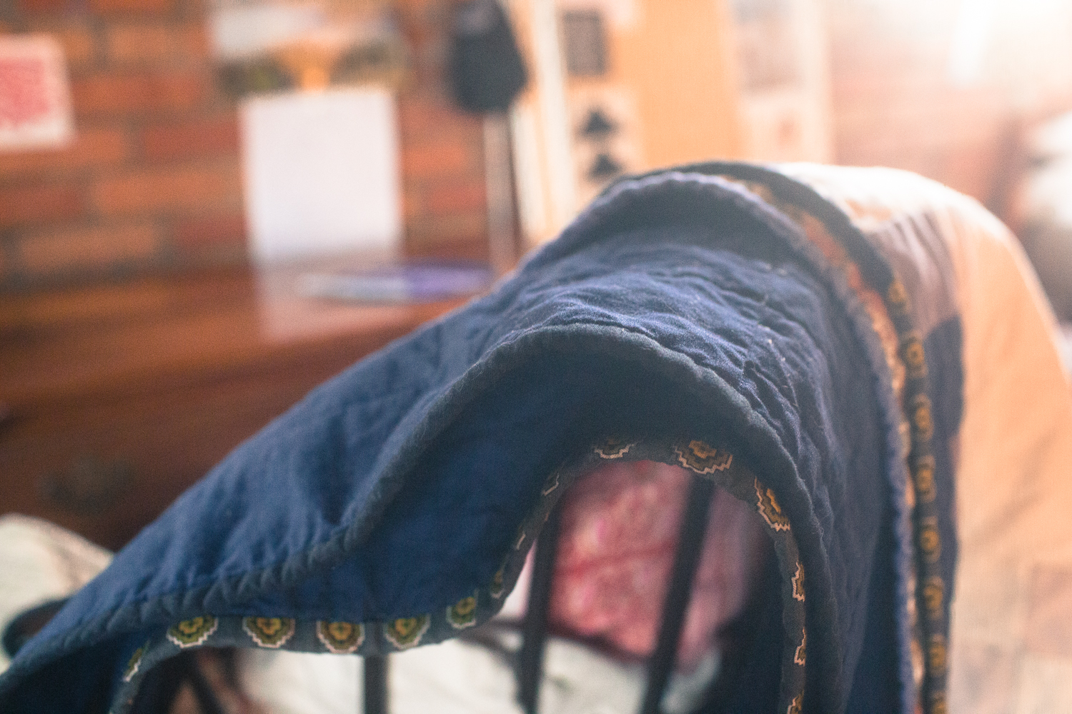
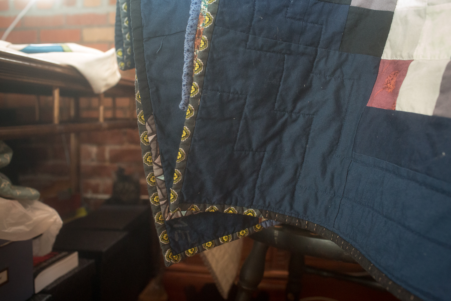
I shipped it off to Lauren and Dave a week after their wedding, and it was waiting for them on the doorstep when they returned home from their honeymoon. (They went to Newfoundland, Canada, perfectly appropriate for those two!)

